Blog

Notes on product, pricing, and building things.

You already know this page: Purple glow. Gradient headline. Bounce on the button. Six identical cards that all say the same thing 🙂

That is AI slop in product design. The model copies the most common screen it has seen, and people clock it before they can say why. They bounce.

I made a short video about the tells, then about how to stop shipping them.

TL;DR

People feel the fake. Write DESIGN.md before any UI or pick a ready made file (e.g. from aura.build or shadcn.io) and edit it until it is yours. Turn that file into components. Load craft skills on top.

Dear Cursor team, I love your product, but please revamp your current upsell flow.

I went through your subscription upgrade experience, and I think there are some fundamental problems with how you're communicating value.

1. You're selling me 𝕏, not Cursor.

Cursor is an IDE. I'm evaluating it against Codex and other AI coding tools. I want to know which models I get, what capabilities they unlock, how much usage I receive, and how my coding experience improves.

Instead, I get a massive list of 𝕏 features, a couple of Grok features, and barely anything about Cursor.

This raises questions from a customer's POV: Why am I evaluating a Cursor subscription based on how much I care about longer posts, video uploads, and 𝕏 analytics? Can I just get a cheaper plan without the Twitter bundle?

Please, be contextual with your upsell.

2. Your value proposition is almost non-existent.

What exactly do I get for €105 or €210?

"Priority model access", "faster responses", and "earliest access to all products and models" don't tell me much.

How will these benefits improve my productivity? What changes in my AI-assisted coding workflow?

I see a significant price jump, but cannot rationalise it.

3. Your plan comparison is too empty.

I understand the intention to reduce redundancy, but now I have one plan overloaded with Twitter features and two neighbouring plans with barely anything to compare.

What makes Super meaningfully better than Premium? What justifies Ultra?

Show me the functional differences. Compare model access, capabilities, usage, and performance.

4. Your information hierarchy needs work.

I'm reading the price, then usage, then going back up to understand that the price is discounted and the actual monthly price is €31.

Why not use a simple strikethrough for the original price?

Also, repeating "3rd party models are charged separately in Cursor" in every plan is unnecessary. Make it a shared footnote.

5. You're trying to sell too much at once.

Recommend one plan and explain why I should upgrade. Focus on the Cursor and AI capabilities that justify the upgrade.

Put 𝕏 features behind an expandable section or dedicate proper space to upsell me to 𝕏 (since you know that I haven't connected 𝕏 my account )

Alternatively, give me a proper comparison of all three plans, showing tangible functional differences.

Don't make me navigate an entire catalogue of features to understand why I should upgrade.

Honestly, I'd love to know your current conversion numbers, because my suspicion is that Premium significantly outperforms Super and Ultra because the higher tiers fail to communicate their incremental value.

Overall, the current experience feels like AI-generated UI: a collection of features distributed across cards without a coherent narrative or meaningful value proposition.

I love Cursor, and that's precisely why I think this experience deserves more attention.

Sell me a better experience, not a bigger bundle of features.
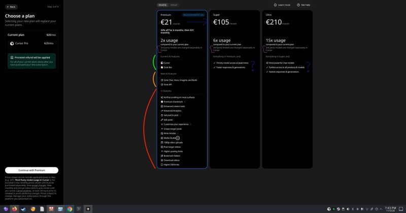
Cursor plan screen comparing Premium, Super, and Ultra, with X features listed inside the Cursor plans.

Imagine telling an app "show me this differently" and watching it actually do it.

That's Generative UI. The interface gets built on the fly, based on what you ask for.

Y'know, chat is a great entry point. But I don't buy that a text box is the BEST UX we can give people. We had a blinking cursor in the 80s. Then we invented buttons. And the frontier labs seem to agree. ChatGPT already renders interfaces inside its answers, and others are heading the same way.

As a PM, this hits a very real pain. Every screen has to work for someone who signed up yesterday and for someone who basically lives in your product. Add more settings? Split it into a simple page and a detailed one? Whatever you pick, someone ends up unhappy.

Here's why I'm excited. If your product is built on an API, it can look like anything as long as it stays within that API. So you design a great default for 80% of your users. The other 20%, the power users, get to reshape it into what they actually need.

You can check one of my prototypes below. A customer looks at their expenses table, right clicks, and types "show me this as progress bars instead of numbers". The view changes. A Generative UI tab appears, so it's clear this wasn't there by default. But it stays. It's theirs now.

I've been talking to a lot of designers and engineers about this, and they're split. Some think it will make every product worse. Others think people are getting used to personalized answers from AI and will soon expect the same from every product they touch.

I'm betting on the second group. But I really want to hear the other side.

So where do you land? Future of UX, or a beautiful mess waiting to happen?

Communication is part of the UX.

In product we love cutting text. Shorter labels, fewer words, one line instead of three. I’ve done it for years and I still think it’s mostly right.

Then I spent some time in New York and noticed that a lot of products there take the opposite approach. Longer copy. The people behind the product explaining why they built it and what they care about. It felt less like marketing and more like someone actually talking to you. Which makes sense. The people who ship features and the people who use them are all just humans.

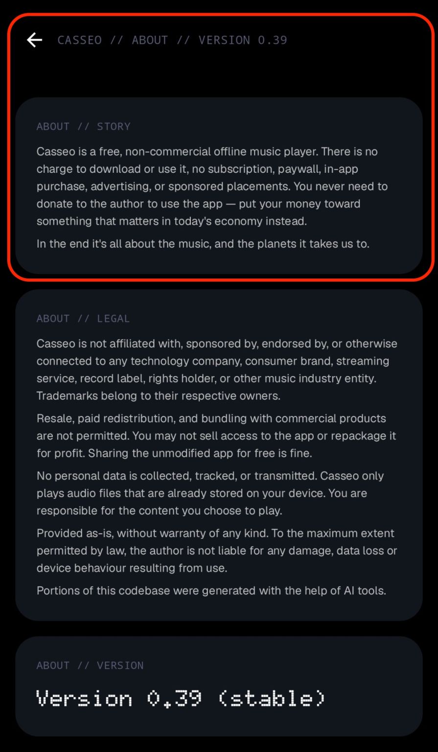
So when I built Casseo, my small offline music player, I added a story section. A few paragraphs about why it exists and why it’s free. Honestly, I thought nobody would ever read it. It sits in the About screen, right next to the legal text.

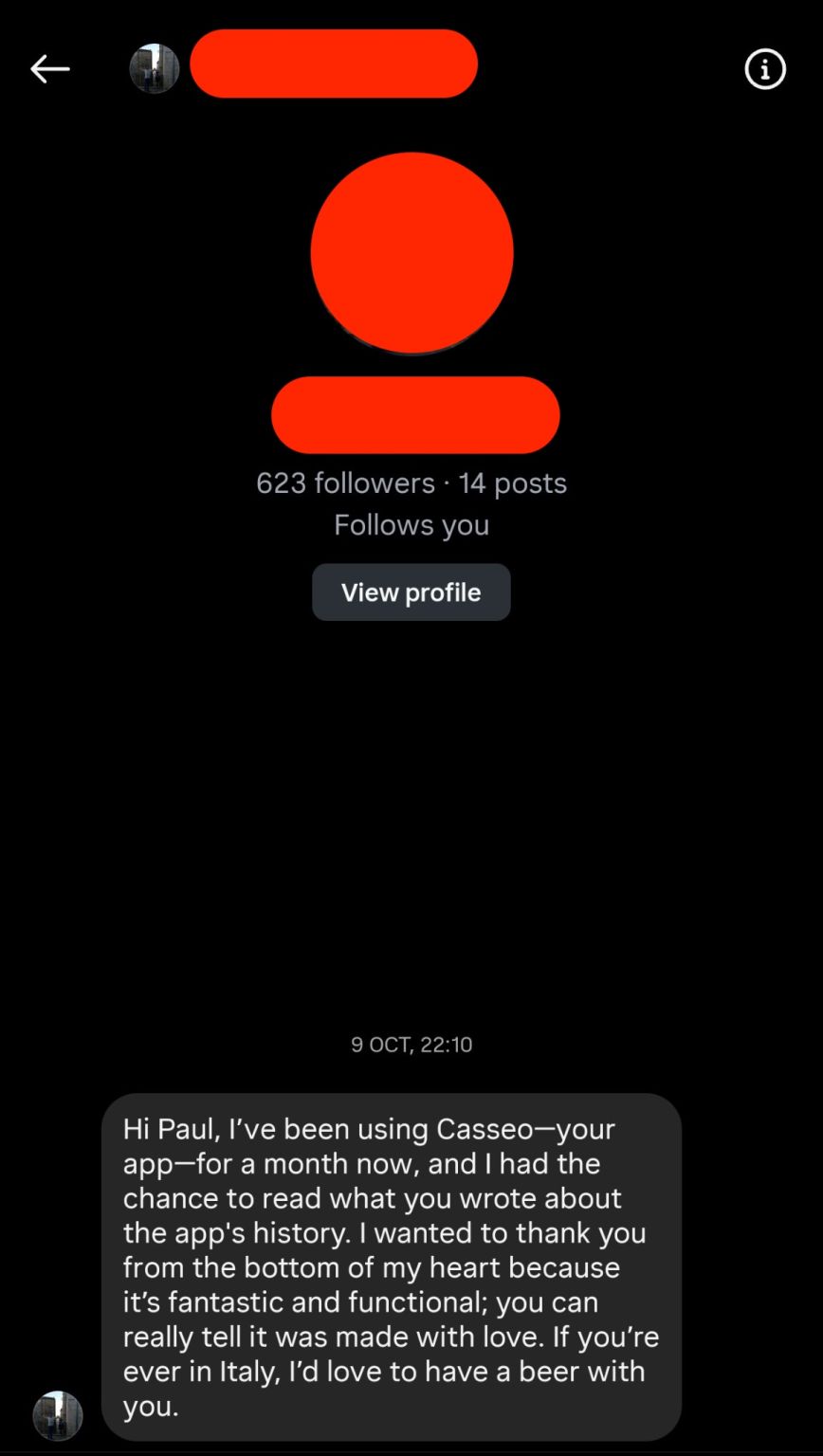
Last week I got a message from a user in Italy. They’d been using the app for a month, read the story, and wanted to say thank you. They said you can tell it was made with love. And if I’m ever in Italy, they’d like to grab a beer.

That message made my week. It was also a good reminder that copy is part of the UX too.

And now that more and more of our text gets written by AI, I think this matters even more. People can tell when someone actually sat down and wrote something for them.

(Also, I’m taking that beer)

Casseo About screen, with the story of the free music player beside the legal text.
A message from a Casseo user who read the story and offered to grab a beer in Italy.

I know that moment when you vibecode your first prototype and suddenly feel like a superhero. You have a power. Everything ships. It’s easy to get encouraged. Frankly, I get it.

I’ve also worked in highly regulated industries, and on products that went from 0 customers to 500,000 in months. At some point you still have to live in the real world, where customer data leaks, cloud bills get weird, payments fail quietly, and “we’ll add GDPR later” becomes somebody’s expensive month. So if you don’t want to get fined or rebuild the whole thing a couple months after going live, ask Claude / Codex about architecture before you invent your own login, about monitoring before users become your QA team, and about legal/privacy before the consent banner is just decoration.

Keep the superpower. Run the boring checks before you ship. Prompts and checklists in the video ↓

I’ve used GTD for years. It’s the only system that actually survived Slack chaos for me.

If you’ve never tried it: "Getting Things Done" is just a way to empty your head into a trusted system. Stuff lands in an inbox, you decide what it is, and then you either do it, dump it, park it, or hand it off. The magic isn’t the diagram. It’s that your brain stops pretending it’s a to-do list.

Lately though, agents changed the shape of the work. Half the stuff in my inbox isn’t “do it / delegate it / defer it” anymore. Some of it should just go to an agent. Some of it isn’t even a task - it’s context the team might need later.

So I sketched a small update to Allen’s flow. Nothing fancy. One gate for “can an agent take this with what I already know?”, and one new bucket for knowledge that shouldn’t stay locked in my Reference folder.

Try it out too, because, why not? :)

You bought a session replay tool. Cool! Now you have Netflix for Product Managers.

Thousands of recordings (and no time to watch them). You open 40 or 50, but how likely you'll randomly find something, that might be useful?

Try this AI-driven workflow:

1. Export the data:

Most replay tools can export session events as JSON, or you can use your existing event tracking. You need the basics: session ID, timestamp, event name, screen/page, and metadata.

2. Give AI some context:

Add your repository, event dictionary, and a short brief:

What are we selling?

Who is the user?

What does a successful flow look like?

What counts as conversion?

3. Ask one proper question:

Not: “Find insights.”

Try:

“Which user behaviours happen more often in abandoned checkouts than in completed ones?”

Now the agent can compare paths:

Successful users → product → cart → payment → confirmation.

Drop-offs → product → cart → promo code → back → exit.

4. Let it find repeated patterns:

Maybe users who open the delivery dropdown twice are 30% more likely to leave.

Maybe they hit “Apply promo code,” get no feedback, and disappear.

Maybe your highest-converting entry point brings 20 purchases, while a “worse” one brings 500.

5. Ask for the report:

Let AI turn the patterns into insights you can actually convert into backlog items. Then watch the replays behind the strongest patterns. And ship an improvement 😉

If AI is going to replace me one day, it better do it with a f-ing style and on my terms

There are things I still want to do myself. But if I spend hours on repetitive emails, messages and the same questions over and over, I won’t have time for anything else.

I don’t trust AI to do that for me. I do trust myself. So I’m building my own clone (kind of).

The interesting part isn’t the LLM. Current models don’t really have behavioral context. They don’t care if it’s 10 AM or 3 AM, Monday or Sunday, whether they’re busy, tired, or actually in the mood to talk.

I do.

So my stack combines an LLM + RAG + personal memory + conversation episodes + a behavioral layer that changes how the model responds based on the moment. Everything runs locally, so far my PC wants to kill itself, but it's fine for the MVP.

The goal isn’t to make AI sound like me. It’s to make it behave like me.

And yeah, this is probably overkill.

If you just want your Claude/OpenAI assistant to sound a bit more like you, I made a Skill for that.

Comment “Skill” and I’ll send it over in DM.

Not gonna lie, I am lowkey tired of the jokes from engineers about PMs sending localhost:3000 of their vibecoded apps to peers. I see a new tweet about it almost every day.

Thankfully, I am not the only one who got tired of them. Apparently, neither is Cloudflare. They’ve introduced Cloudflare Tunnel to make localhost "shareable".

I like to focus on user pains. And the pain is simple: user has a prototype or app that they want to share with peers, but they have no idea how networking works, what makes an app public, or how to expose it safely.

Seems like this pain is about to be gone.

1. You install cloudflared on your machine

2. It makes an outbound connection to Cloudflare

3. It gives you a link you can use to share with your peers

Boom. No open inbound ports. No exposed IPs. Super-easy way to share your vibecoded app with someone else.

More here: Cloudflare Tunnel

I've promised to myself this year to have fewer subscriptions. I went through the list and Spotify was an easy cut. So I've started to buy the albums. Then I needed a player. I tried almost everything on Google Play. They're bloated with extras, or paid, or full of ads. I didn’t like any of them. And so I built mine. It’s called Casseo.

Here's the link: Casseo on Google Play

Android only, for now.

Casseo is fully free. No ads. I don’t collect your data. I will never ask you for a penny.

Also don’t expect me to put the typical LinkedIn thing here like “Proud Founder and CEO of Casseo”. It’s just a music player I made because I was annoyed.

If you still own your music and you just want something to comfortably listen to it, take it.

A single doc for alignment and for building sounds efficient. It usually isn't. You generate a long spec, share it, and nobody reads it because it reads like nobody wrote it. Or you keep it short, people actually read it, and then they show up with a hundred questions about how things are supposed to work.

The fix isn't to stop using AI for docs. It's to stop asking one file to do two jobs.

I now split each initiative into two files.

A3 is one page, written by hand. Problem, goals, constraints, decisions. That's what I share when the team needs to agree on direction. A human wrote it, so people read it.

Agent Doc is the full spec: flows, edge cases, fields, errors. I draft it with an LLM. Nobody reads it cover to cover, and that's fine. People query it when they need something specific, or build skills on top of it. The AI output goes somewhere useful instead of into a doc everyone pretends they read.

So the frameworks is simple as it sounds:

Agent Doc first, A3 second, then build. Spec changes go into Agent Doc. The rest follows from there.

Hot take: LLMs should be a second-level interface, not the first one.

Remember when Google Search just… worked?

Remember when creating a notification was a single tap?

Remember when we didn’t have to wait 3 seconds for a “Smart Summary” to load, only to realize it missed the point?

We are currently in a phase where we are throwing AI at problems that were already solved. Replacing fuzzy search with LLMs? That’s a waste of tokens. Replacing simple filters with natural language prompts? That’s a waste of cognitive load.

If I do a task 100 times, I want the output to be exactly the same on the 101st time.

That is Deterministic UX. It builds muscle memory. It builds trust.

AI is Probabilistic UX. It’s abstract. It’s "maybe."

And "maybe" is a terrible default for a "Save" button.

AI should be the co-pilot that only wakes up when I veer off course.

If I’m happy → let me click.

If I’m stuck → let me ask.

If you are a PM struggling to decide where to put the AI, here is a framework I call the "Click-Fix-Create":

1. Click → Deterministic. The user knows what they want. Give them buttons, filters, and instant sorting.

2. Fix → Augmented. The user tried "The Click" and failed (e.g., 0 search results). Now trigger the AI to interpret intent or suggest alternatives.

3. Create → Generative. The user starts with a blank canvas and has no idea where to go. This is where Chat/LLM shines.

Hackathons aren’t about free pizza or pretending work is “fun”. They’re a reminder.

That you can still be creative.

That you can still ship something fast.

That you can still deliver value without 20 meetings arguing about the color of a button.

In a company with thousands of people, that’s powerful. It’s a shake-up ritual. It reminds you that you’re surrounded by very talented people who can move mountains if you just let them build.

My personal advice: if you feel stuck, if your project isn’t moving - build something. Doesn’t matter how small. Solve one problem, maybe even just for yourself.

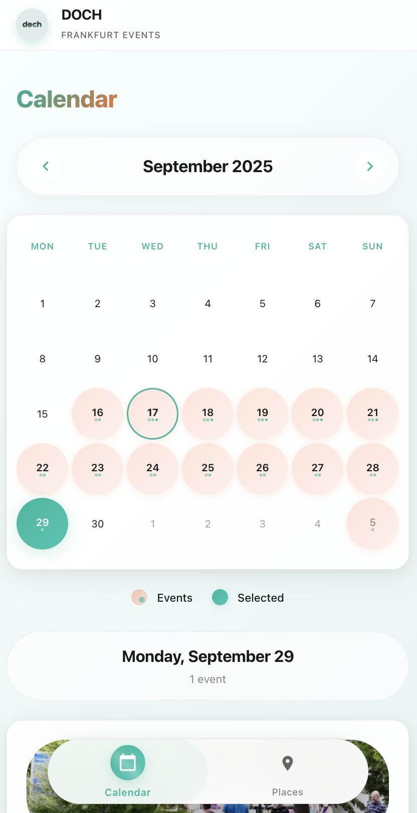
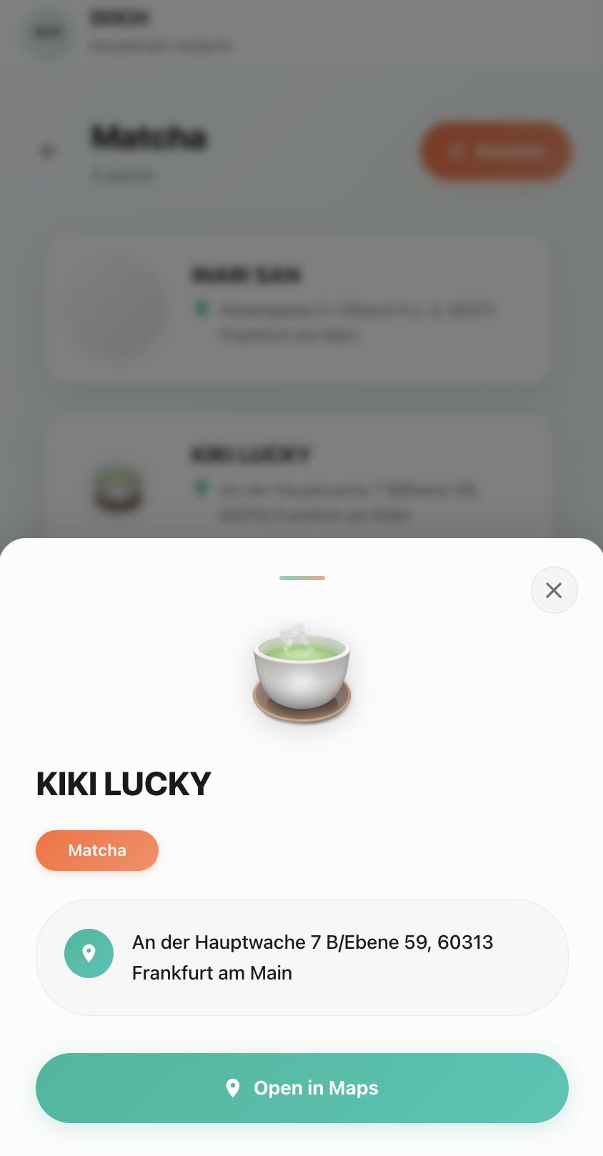
Recently I felt blocked at work. Two big projects, lots of hinders. So I grabbed my wife (Darya Kalaba) and my friend Ruslan Kimossov, and we hacked together a simple events & places recommendation app for migrants in Frankfurt. A weekend project. But it worked, I came back on Monday, and suddenly we started cracking hard problems with our product designer one after another.

Sometimes you don’t need a break.

You need a win.

DOCH Frankfurt Events calendar for September 2025, with days that have events marked.
A place card in DOCH for Kiki Lucky, a matcha spot in Frankfurt, with an Open in Maps button.